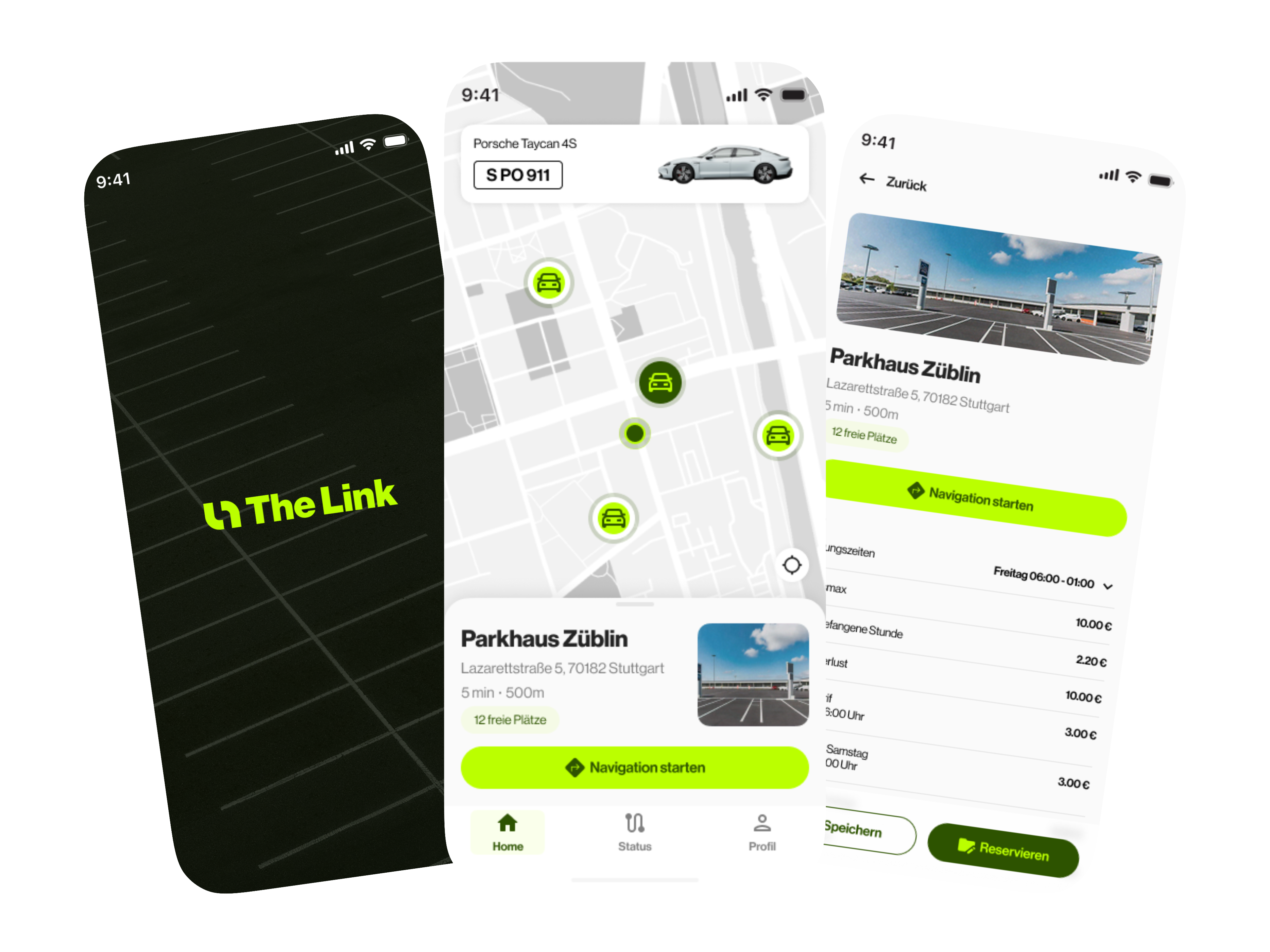
Find parking options on the map.
01 Visual foundation
Developing brand and interface
together.
We started with a rough logo idea and developed a visual foundation of wordmark, symbol, colours and typography, applying the direction directly to the app.
This gave the concept a coherent identity, from the first impression through the map, car park information and reservation actions.

02 Reservation prototype
Making the core flow
ready to demonstrate.
The broader product idea connected parking with local offers and other services. For the first prototype, we focused on reserving a parking space.
The map provides the entry point. A car park card shows key details, with opening hours, prices and a reservation action in the detail view. This demonstrates the intended path from orientation to a specific choice.

Review location, availability and terms.
Move from the detail view into the reservation.
03 Additional concepts
Making information accessible
on the move.

We also designed views for situations where the app is not in the foreground. The Live Activity concepts show the car park, parking duration and associated vehicle.
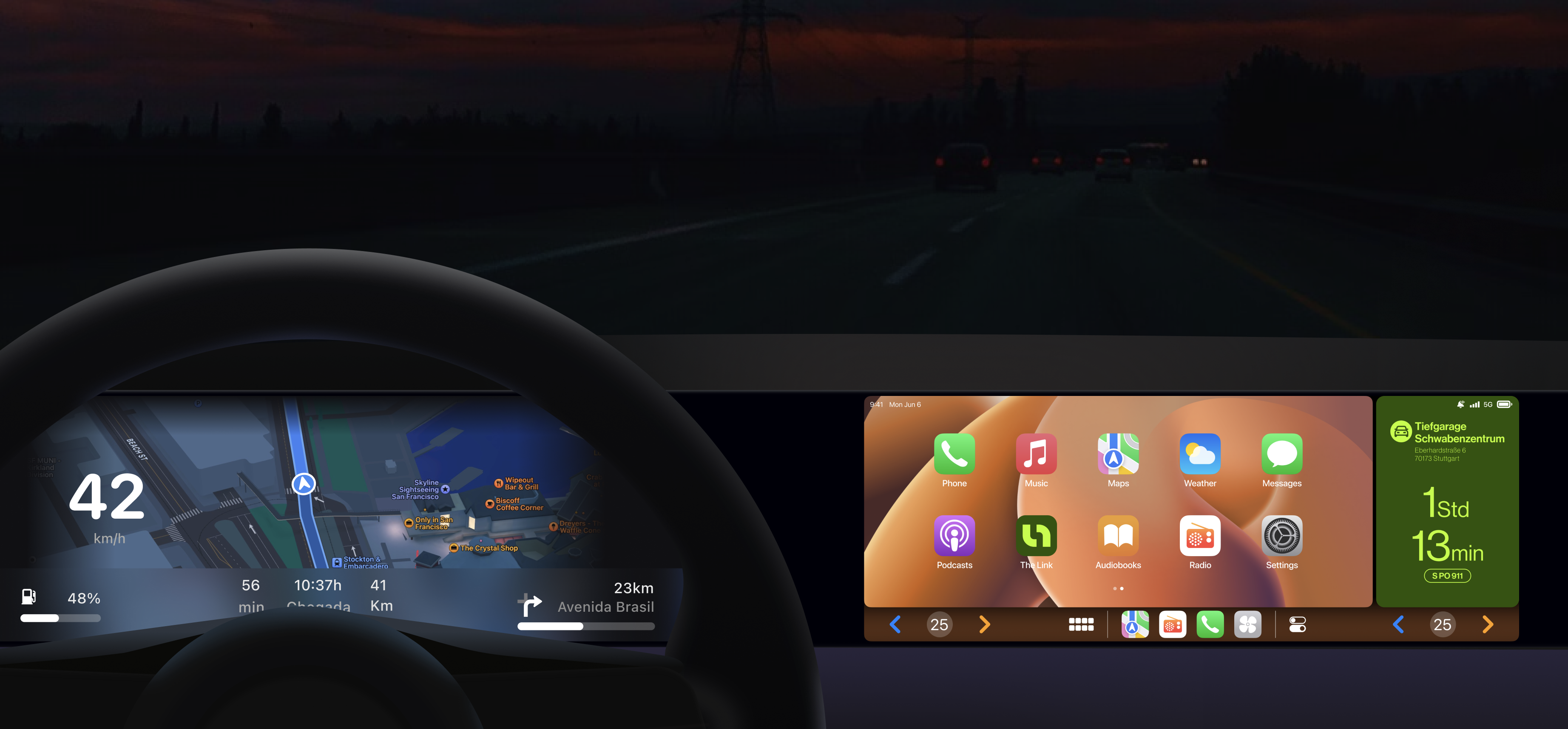
A CarPlay concept brought this idea onto the vehicle display. Both illustrated possible extensions of the product.
Live Activity and CarPlay are design concepts. The clickable app prototype remained focused on reservations.
04 My responsibility
Setting the direction.
Leading my team.
I led the concept work and client coordination, established the design direction and guided the designers in the userdoo team.
We developed the screens and clickable prototype together. My role combined client coordination, design decisions and leadership of the userdoo team.
Collaboration
My contribution
Concept, design direction, coordination and team leadership
Tommy Haacke and team
Joint development of screens and prototype
Client side
The team behind the product idea
Outcome
A tangible foundation
for partner conversations.
The prototype made the idea tangible for potential partners without requiring the client to commission a complete app first.
A coherent identity
Logo, colours and typography gave the idea a visual foundation.
A demonstrable flow
The reservation prototype made the intended experience concrete.
Views for use on the move
Live Activity and CarPlay illustrated potential additional touchpoints.
THE LINK remained in the concept and prototype phase. The app was not released.